When I decided to formalize my business, one of the first things I wanted was a logo. My logo would be an important part of my business, and by extension a piece of me. Logos are meant to grab attention, be memorable, and represent your business and brand. A logo is more than just something to slap on business cards and web pages – it’s a way to show clients what you and your business are about, what you represent, and how they will remember you.
When I hired someone to develop my logo, I gave her some specific guidance. I actually didn’t have to spend a lot of time deciding what I want my logo to look like because it’s something that has represented me my entire life.
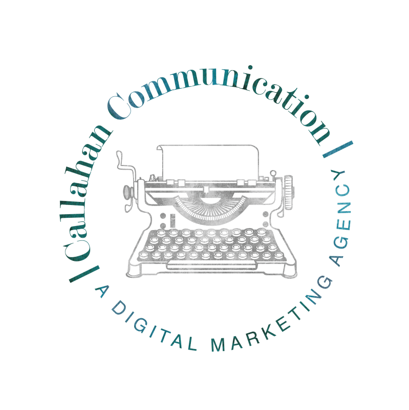
First, I knew I wanted a typewriter. When I was a child, like six or seven years old, my grandparents had an old typewriter they would let me use to play with. I would write poems and short stories and notes, loving the way the keys sounded as they clacked across the paper, and the pressure on my little fingers as I typed away. A typewriter is how I got started writing. And it also represents classic writing, strength, and timelessness. Now, it’s sitting on my desk in my office and to me represents the power of the written word.
Second, I knew I wanted to incorporate my business name. The name represents me (Callahan) and what I do (Communication), and seeing it would make it easy for someone to know what my business was all about. I also wanted the font to be clear and professional, but not stuffy.
Third, I knew I wanted to incorporate the color teal. Teal combines the calming colors of blue with the renewal qualities of green. It’s revitalizing and rejuvenating, and represents open communication and clarity of thought. It’s said that someone who’s favorite color is teal is friendly and approachable, easy to communicate with, compassionate, empathetic and caring, with a heightened sense of creativity. This all describes who I am and what I wanted my business to be, and how I wanted my clients to feel about working with me.
When the woman I hired sent me back her drafts of my new logo, I immediately had tears in my eyes. It was exactly as I had imagined. She sent me a variety of sizes and placements, and I couldn’t have been happier.


If you’re creating a logo for your new business, or even re-designing your logo, here are a few tips I found important to keep in mind.
- Express yourself. The colors, shapes, fonts, and imagery should represent who you and your brand are. They should attract and be attractive to your prospective audience.
- Remember your audience. Your logo should speak to them, and represent who they are as customers. For example, a law office should have a different type of logo than a toy store.
- Make a statement. Your logo should accurately represent your business without someone having to look up what you do. Be captivating and visually appealing. Don’t be afraid to be bold, but don’t go overboard with complicated.
- Keep it simple. Be sure the imagery and words are legible at all sizes. Don’t make the logo too crowded, complicated or confusing. Think about everywhere you will be putting it (business card, website, letterhead, on a storefront sign, on apparel or other merchandise, etc.) and be sure it’s designed to work with different variables.
- Don’t be afraid of color. Choose colors that go well together and represent your brand. Most of the time, your logo’s colors will represent your brand’s color scheme and colors you’ll focus on across the board. Consider how the logo will also look in black and white, and greyscale.
- Test different fonts, but don’t use more than two. Try to avoid the common ones, and go with something a little different so you stand out from the competition.

[…] written about why I chose a typewriter for my logo and it comes down to this – with today’s technology, anyone can be a […]
LikeLike